How to Make a Great Home Staging Business Card
Mar 12, 2018
What makes a great home staging business card? One that does not get thrown away by your potential client.
We are in an image-driven industry, so it is important to deliver an impactful visual when you hand someone your business card. Often, this is someone’s first impression of your business and your marketing materials. You want people to walk away thinking, “Wow, if they take the time to create such a beautiful card, I can depend on them to stage a beautiful house to sell.”
Your business card should reflect the clients you want and distinguish you from your competition. Think of all the business cards that real estate agents receive from mortgage brokers, title companies, painters, and others. A memorable business card is a key component of your home staging marketing strategy.
Here are some approaches for designing a great home staging business card.
Heavy Cardstock
Luxe cards are available with a heavy cardstock. They are more expensive but will establish your brand as a luxury staging company. Luxury materials will contribute to the perceived value of your brand.

Different Texture
A gritty matte surface, linen texture, or velvety smooth paper can add to the tactile experience of your home staging business card. Add embossed lettering or logo so your clients can actually feel it. When rifling through all of the business cards they received at a networking event, yours will feel different in their hand.
Pro Tip: Whatever paper you choose, ensure that at least one side of the card can be written on. That way, you or your client can write notes if necessary. For example, you may want to leave a personal note on the card so the recipient will remember you (“It was so nice chatting about our shared love of corgis!”). While attractive, glossy or embossed paper may repel pen ink.
Unusual Shape
You can order business cards that are mini, octagon, round, or even shaped like a house. There are numerous die cuts available for a variety of shapes.
While a shaped business card may be unique, it could also be challenging to fit in a wallet or store with other business cards. Consider something subtle and professional, like a square business card or one with rounded corners, which will still be convenient for the recipient.
Text and Fonts
Edit ruthlessly. Ask yourself what content is truly necessary. Your street address can probably be excluded (unless you have a showroom where you want visitors). If you put too much info on your card, then nothing is a priority, and it will make all the info too small to read.
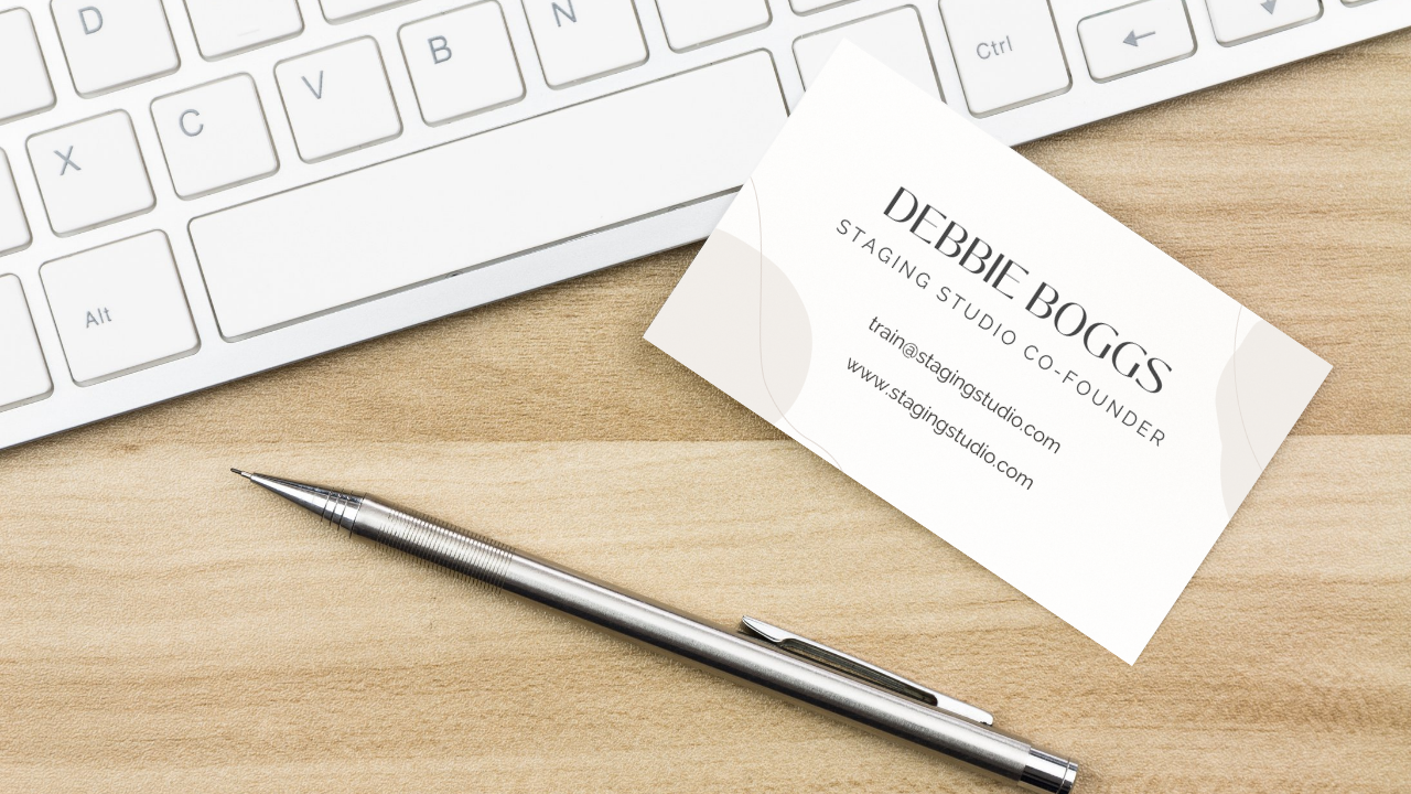
Make sure to select a font that is easy to read. Important information such as your phone number, website URL, and email address should all be in a simple serif or sans serif font (not a script or handwritten-style font). All of the text should be at least size 8 point.
Pro Tip: Test your business card design by printing it at home on regular paper before ordering professional prints. That way, you can see if it is easy to read and check the sizing on your fonts, logo, and images. You may find elements that look clear on your screen are actually too small or blurry when printed.

Social Media and Website
While you may need to pare down some of the information on your card, you will want to keep ways for your clients to find you online.
Encourage clients to connect with you on social media by adding your social media usernames to your business cards. This is a great reason to choose a home staging business name that allows you to have the same social media handle on different platforms. That way, you can save space by just printing @yourbusinessname, instead of different usernames for each platform, like Instagram, Facebook, and TikTok.
Don’t forget your home staging business website URL. You could even add a QR code that takes them directly to a page on your website where they can request a free staging quote.
Photographs
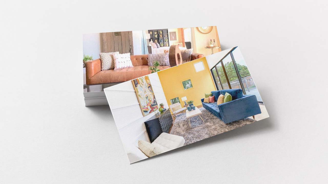
You’re not limited to your logo and text. Staging is a visual industry, so why not add beautiful images from your home staging portfolio?
You can also follow the example of real estate agents and put your professional headshot on your cards, so people will remember you.

Don’t Forget the Back
A classic way to use the back of your card would be to spotlight your company logo, as demonstrated in the image above. However, this space can also be used for special offers, additional information like a slogan or home staging statistic, or photos of your home staging work. We recommend using your logo somewhere on the card, so if it is not printed on the back, you can incorporate it onto the front.
At companies like Moo, you can print a different image on the back of every card. Select several of your favorite images from your home staging portfolio – and always confirm that you have permission from the photographers to use their photographs in your marketing materials.

Think Beyond Paper
You may consider something outside the box. Printers today can print on almost anything: wood, plastic and even metal.
What about 3D lenticular business cards? This type of card shows dynamic images with movement. It would be so cool to show someone opening a door to a home or a seller celebrating with a sold sign.
You can even get a business card which incorporates a USB drive. You could upload a video presentation on the benefits of staging!
While there are so many neat options available, you might be tempted to go overboard with special features. Make sure whatever you choose will resonate with your target client and is in line with your staging business’s branding.
When in doubt, keep it simple. You can also share your business card ideas and ask for feedback in the Staging Studio Society, the Facebook group for home stagers and redesigners.
If you want to learn more tips and staging strategies, our Staging Design Professional® course includes everything you need to be a BOSS Stager!
Don't miss our next blog like this!
Join to receive the latest news for home stagers.


